Card
A container block that behaves like a Group, plus one switch: Link This
Card. With it on, the card renders as a single <a> element wrapping all of
its content, so every part of the card — the image, the padding, the gap between
two lines — is the link.
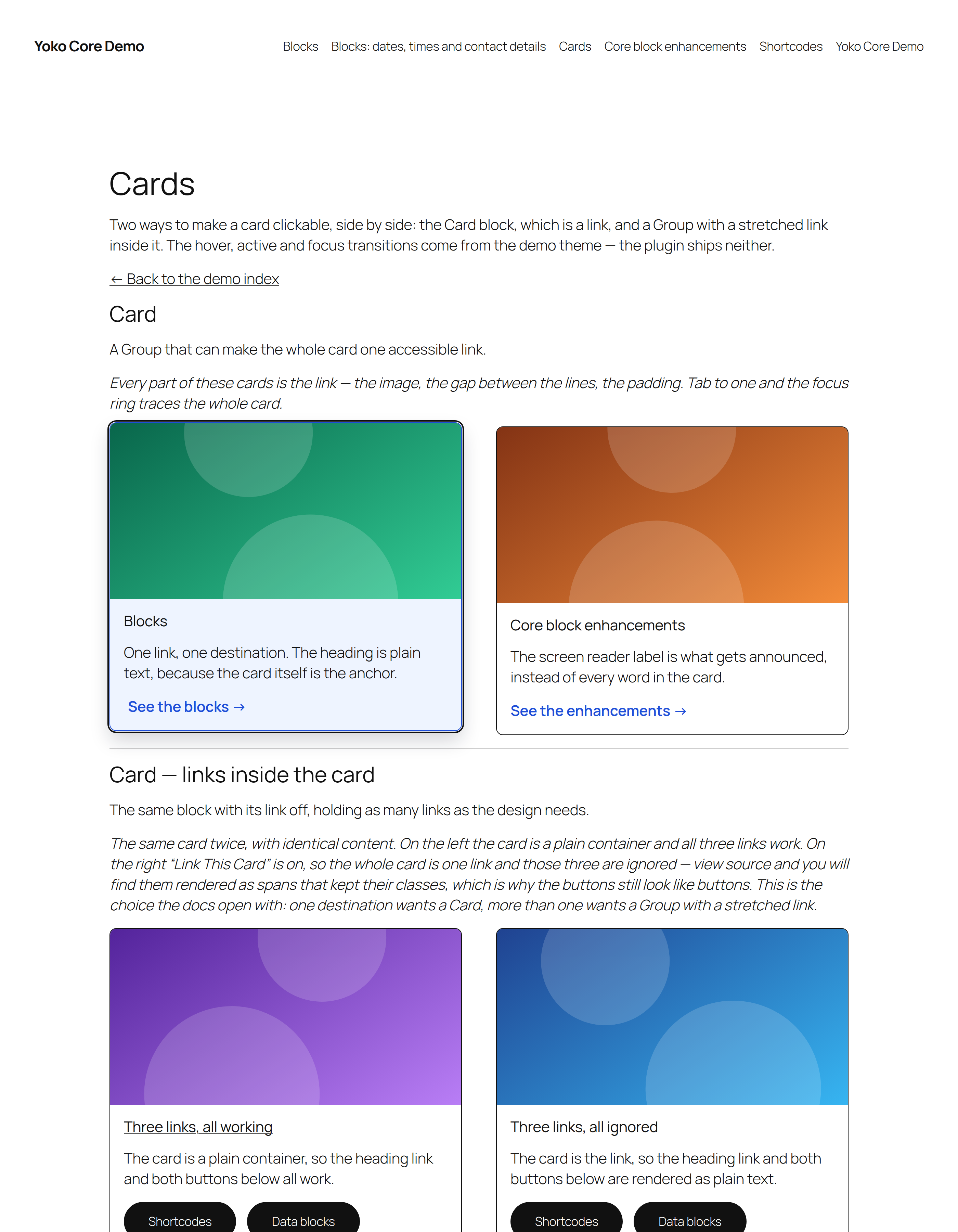
Keyboard focus on the left card. The ring traces the whole card, because the whole card is the link. Its hover treatment — the lift, the tint, the arrow sliding right — is the theme's, not the plugin's.
Which card do I want?
Yoko Core has two ways to make a card clickable, and they are not interchangeable.
| Card block | Group + stretched link | |
|---|---|---|
| Markup | one <a> around the whole card | a <div> with an invisible overlay on one link inside it |
| Accessible name | a block inside the card, or the label you write | the link's own text |
| Other links in the card | ignored — see below | keep working |
| Copy link address | works anywhere on the card | only on the link |
| Styling hook | the card element itself | .yoko-link-container |
| Best for | a card with exactly one destination | a card with a headline link and other links beside it |
Rule of thumb: one destination, use a Card. More than one, use a Group with a stretched link.
For editors
Insert Card from the inserter, then build inside it exactly as you would in a Group — any blocks, any layout, all the same colour, border, spacing and layout controls.
Link This Card
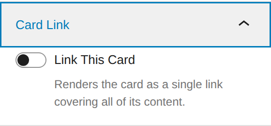
The toggle is in the Card Link panel in the block inspector. The chain-link button in the block toolbar does the same thing, and opens the link popover a Button block uses — search for a page, or paste a URL.
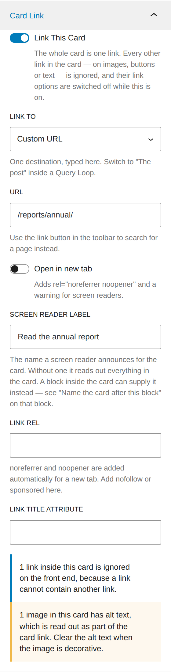
Turning it on gives the card the options a Button or a Link already has:
| Option | Where | What it does |
|---|---|---|
| Link to | panel | Custom URL, or The post for a Query Loop — see below. |
| URL | panel, toolbar popover | Where the card goes, in Custom URL mode. Until this is set, the card is still a plain container. |
| Open in new tab | panel, toolbar popover | Adds target="_blank", plus rel="noreferrer noopener" and a warning for screen readers. |
| Mark as nofollow | toolbar popover | Adds nofollow to rel. |
| Screen reader label | panel | What a screen reader announces for the card — on its own, or as a prefix in front of the name the card takes from its own content. See below. |
| Link rel | panel | Anything else the rel attribute needs. |
| Link title attribute | panel | The title attribute. Rarely useful; a tooltip is not an accessible label. |
In a Query Loop
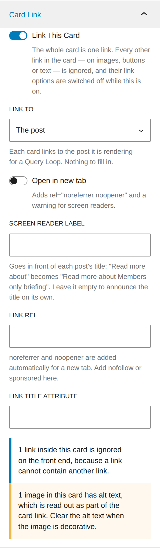
Set Link to to The post and each card links to the post it is rendering. Nothing stores a URL: the permalink is read from the loop's block context when the page renders, the same way the Post Title, Read More and Featured Image blocks resolve theirs.
Two things follow from that, both of them the point:
- The accessible name defaults to the post's own title. One label written by hand would be announced identically on every card in the loop, which is worse than no label. Anything you do type in Screen reader label goes in front of the title rather than replacing it, so "Read more about" gives you "Read more about Members only briefing" — different on every card, and still saying what the link does.
- Outside a loop it renders as a plain container. There is no post in context on, say, a normal page, so there is nowhere to go — and the links inside the card keep working rather than being swallowed by an anchor that goes nowhere.
Because a third-party block cannot use them. WP_Block::process_block_bindings()
gates bindings on a hardcoded list of four core blocks — Paragraph, Heading,
Image and Button — with no filter and no block.json opt-in, and neither of
core's two binding sources (core/post-meta, core/pattern-overrides) yields a
permalink in any case. Block context is the mechanism core itself uses for this,
and it works today.
If the URL you need lives in a custom field, that is bindings territory,
and the way to get it today is a Group with a
stretched link on a Button: core/button
is on that allowlist, so its URL can be bound to core/post-meta.
Naming the card after its own content
A card link needs a name, and typing one into the sidebar is fine for a card you write once. It stops being fine the moment the card is reused: in a pattern, the heading and the label are the same sentence stored twice, and whoever drops the pattern onto a page and rewrites the heading has no reason to know the second copy exists. The card then announces the old text.
So the name can come from the card's content instead. Select a block inside the card and switch on Name the card after this block, in the Yoko Card panel.
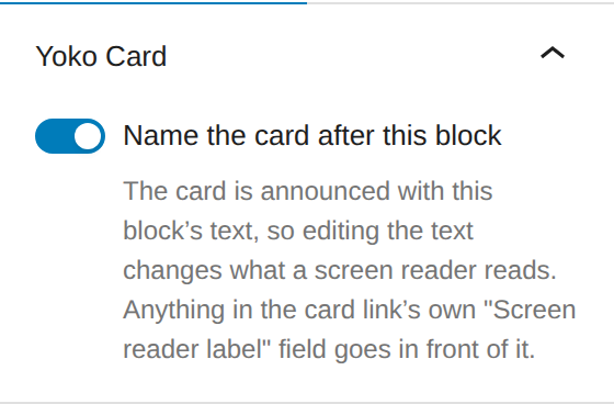
From then on the card is announced with that block's text, and there is only one copy of it — rewrite the heading and the announcement changes with it. The card's own Card Link panel confirms what a visitor will hear.
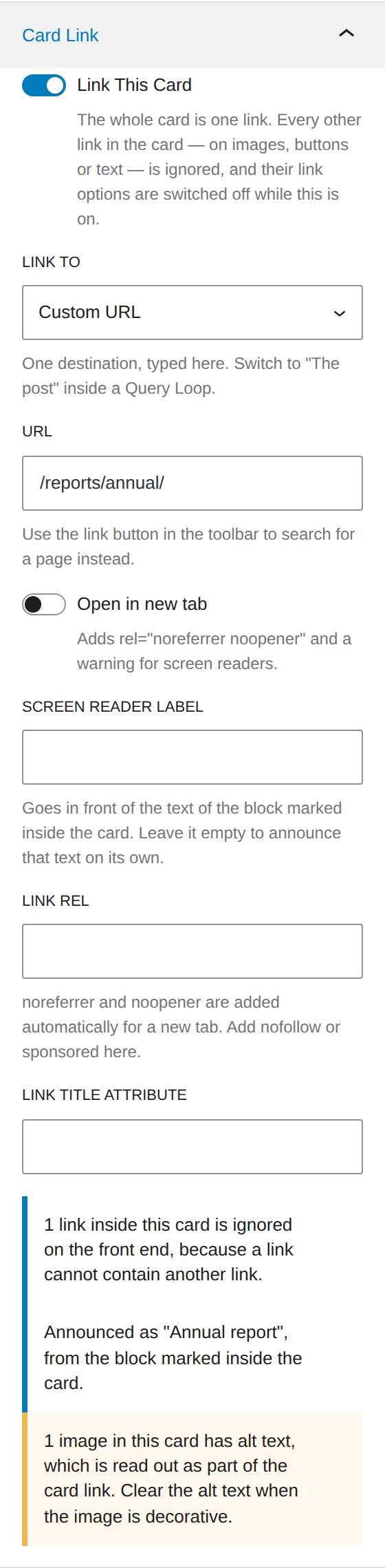
The blocks that can be marked are Heading, Paragraph, Post Title, Button and Site Title. Three rules, all of them visible in the editor:
- The label field becomes a prefix. Mark the heading and type "Read more about" and the card is announced "Read more about Membership benefits". Leave the field empty and it is announced as the heading alone.
- The first marked block wins, in the order the blocks appear. Marking a second one is not an error, but the panel on that block says it is not the one being used.
- A mark inside a nested card belongs to that card, not to the one around it.
In a Query Loop this is how you name each card after something other than the post title — mark a Post Title block and it resolves per post exactly as the link does, or mark a Heading holding fixed text if that is what the design wants.
Mark the heading, leave Screen reader label empty, and the pattern needs no accessibility instructions in its description. Whoever uses it writes the heading, which is the one thing they were always going to do.
What happens to the links inside
An HTML link cannot contain another link — the browser closes the first one as soon as it meets the second, which would cut the card link short. So while Link This Card is on:
- Every link inside the card is rendered as plain text on the site. A button keeps its button styling; it just stops being clickable.
- The link options on the blocks inside are switched off in the editor, and an Image inside the card shows as unlinked, matching what the visitor will get.
- Nothing is deleted. Turn Link This Card off and every inner link is back.
The Image block's toolbar, inside a linked card and outside one — the link control is the only thing that changes:

Inside a linked card. The chain-link control is gone.

The same image in a card that is not a link. Everything else is identical.
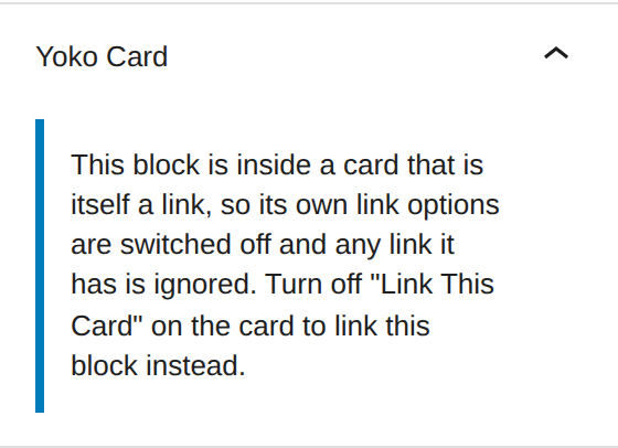
The blocks whose link options are switched off are Image, Button, Media & Text, Gallery, Post Title, Featured Image, Excerpt, Read More, Site Logo and Site Title. Whatever that list says, every link inside a linked card is ignored on the site — the list only decides which controls the editor hides.
Warnings the panel shows
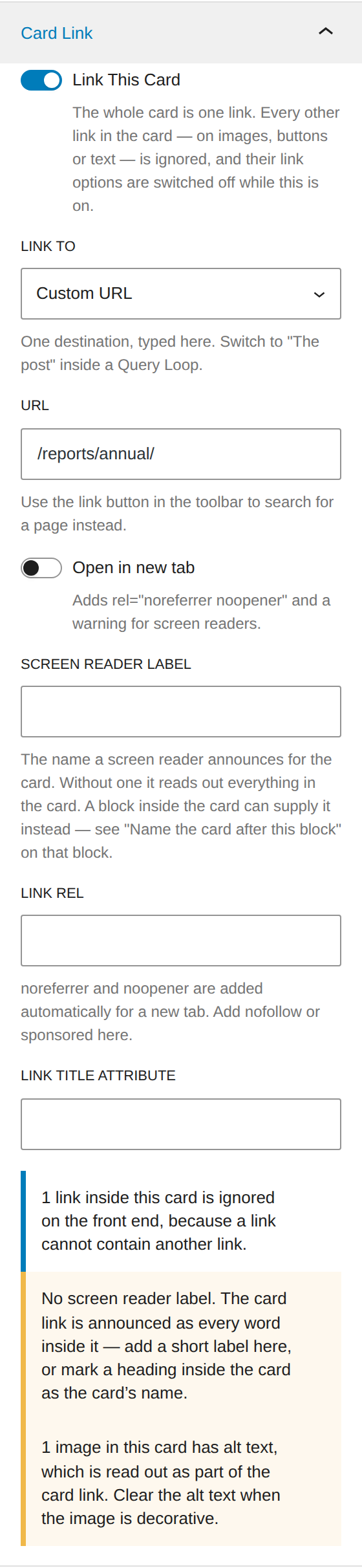
| Warning | Where | Meaning |
|---|---|---|
| No URL yet | the card | The toggle is on but there is nowhere to go, so the card is still a container and its inner links still work. |
| N links inside this card are ignored | the card | Expected, and worth a second look: if you need those links, use a Group with a stretched link instead. |
| No screen reader label | the card | The card link will be announced as every word inside it. Write a short label, or mark a block inside the card as its name. |
| Announced as "…" | the card | Not a warning: the card has a name, taken from the marked block, and this is what a visitor will hear. |
| N images in this card have alt text | the card | Alt text is read out as part of the card link. Clear it when the image is decorative. |
| N blocks in this card are marked as its name | a marked block | Two or more blocks are marked. The first one wins; this one is not it. |
| Its own link options are switched off | a block inside | The card is the link, so this block's own link is ignored. |
A linked card is outlined with a dashed border in the editor canvas, so the click area is visible without selecting it.
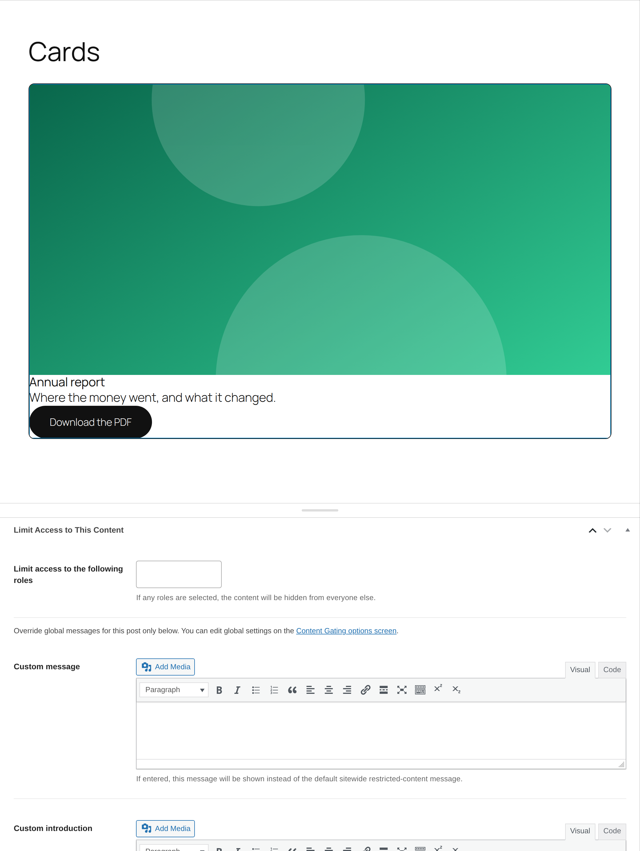
The dashed outline is editor-only and never renders on the site. It is hidden on the card you have selected, so click elsewhere to see it.
Accessibility
Three things make the difference between a card link and a card link a screen reader user can stand.
- Give the card a name. Without one, the accessible name of the link is every word in the card, read as one run-on link. "Read the annual report" is a name; the whole card is not. Either write it in Screen reader label or mark a block inside the card as the card's name — the second is what a pattern or a Query Loop wants, because it cannot go stale.
- Empty the alt text on decorative images. An image inside the anchor contributes its alt text to the link name. A card image is almost always decorative — the heading already says what the card is.
- Do not put anything else interactive in a linked card. Buttons, form fields and other links are invalid inside a link, which is why they are neutralized. If the card needs them, it needs a stretched link instead.
Keyboard focus lands on the card as a whole, so the focus ring traces the whole card. That is correct: the ring should match what a click will do.
Styling the card
Yoko Core ships the mechanic and no design. Two classes, both on the card element:
| Class | On |
|---|---|
wp-block-yoko-card | every card |
yoko-card--is-link | a card that rendered as a link |
The only rules the plugin applies to a linked card are mechanical: display: block (an anchor is inline by default), and color: inherit with
text-decoration: none, without which the theme's link colour and underline
would repaint every word in the card.
Because the card is the link, one transition on the card element covers everything inside it — no overlay, no JavaScript:
.wp-block-yoko-card {
	transition:
		background-color 250ms ease,
		box-shadow 250ms ease,
		transform 250ms ease;
}

.yoko-card--is-link:hover,
.yoko-card--is-link:focus-visible {
	box-shadow: 0 14px 28px rgba( 15, 23, 42, 0.18 );
	transform: translateY( -6px );
}

.yoko-card--is-link:active {
	transform: translateY( -1px );
	transition-duration: 80ms;
}
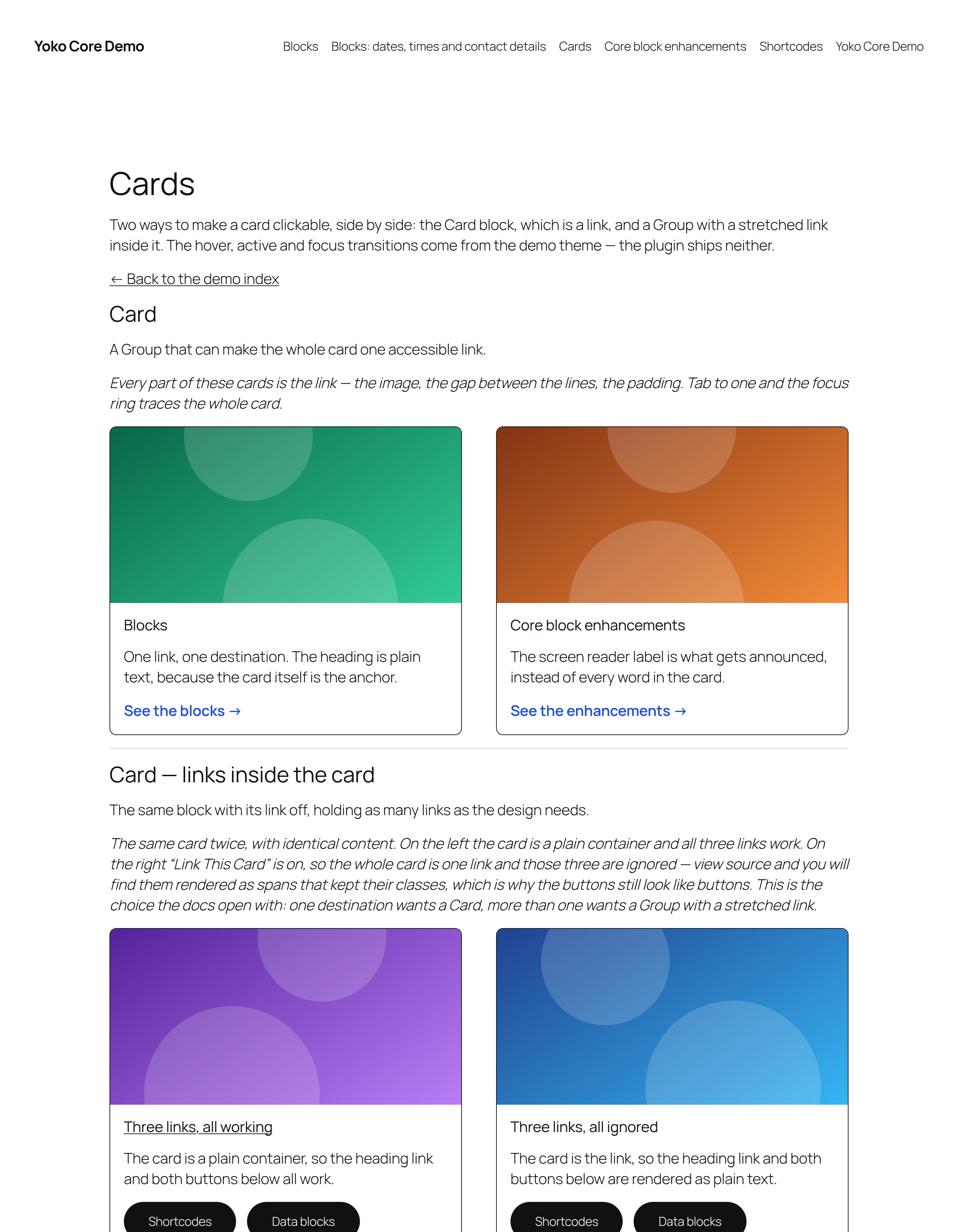
The Cards page on the demo site: the Card block and a Group with a stretched link, set up the same way so the two can be compared.
:hover, :focus-visible and :active all apply to the card itself, and
descendant selectors reach anything inside it — .yoko-card--is-link:hover img
works. The stretched link docs
show the same three states on a container that is not itself a link.
A neutralized inner link gets yoko-card__link-ignored alongside the classes it
already had, if a theme needs to style it differently from a real link.
The Cards page on the Playground demo site shows these three states side by side with the stretched-link version of the same card. The transitions there come from the demo site, not from the plugin.
Block editor, classic editor and page builders
| Surface | Block themes / Gutenberg | Classic editor / Beaver Builder |
|---|---|---|
| The block | In the inserter under Design | Not available — blocks are not registered in the classic editor, and Beaver Builder has no Card module |
| The equivalent | Card block, or Group + stretched link | A Beaver Builder row or column with its own link, or the theme's card markup |
| Front-end classes | wp-block-yoko-card, yoko-card--is-link | none — the block does not render |
This is a block. A post type a page builder has taken over cannot use it. For
those layouts, link the row or module in Beaver Builder and style
.fl-row a / .fl-col a in the theme.
For developers
Markup
An unlinked card:
<div class="wp-block-yoko-card">…inner blocks…</div>
A linked card:
<a class="wp-block-yoko-card yoko-card--is-link"
   href="/reports/annual/"
   aria-label="Read the annual report">…inner blocks…</a>
The block declares usesContext: [ "postId", "postType" ], which is what makes
The post mode possible: a block only receives the context it asks for.
The block is server rendered, so the wrapper is built in PHP and only the inner
blocks are stored in the post. Switching between a div and an a is therefore
not a markup change the editor has to be taught about, and the anchor's escaping
lives next to the pass that neutralizes the links inside it.
Attributes
| Attribute | Type | Default | Renders as |
|---|---|---|---|
isLink | boolean | false | an <a> element, when url is also set |
linkTo | string | custom | custom, or post for the permalink from block context |
url | string | — | href, in custom mode |
linkTarget | string | — | target, and rel="noreferrer noopener" |
rel | string | — | rel |
linkTitle | string | — | title |
linkLabel | string | — | aria-label, or its first half — see below |
tagName | string | div | the element an unlinked card renders as |
anchor | string | — | id, on either shape of card |
tagName accepts div, section, article, aside, header and footer;
anything else falls back to div. A linked card is always an <a>.
The aria-label is composed rather than stored: linkLabel is an optional
prefix, followed by the first name source that yields anything.
| Order | Source | Read from |
|---|---|---|
| 1 | a descendant block with yokoCardLabel: true | the parsed tree — attrs.content, attrs.text, or the block's innerHTML |
| 2 | the post, in post mode | get_the_title() on the postId in block context |
| 3 | nothing | no aria-label is rendered |
yokoCardLabel is a boolean added by this plugin to the blocks
YokoCo\Blocks\CardLabel::get_label_blocks() names, so it is stored in those
blocks' own comment attributes:
<!-- wp:heading {"level":3,"yokoCardLabel":true} -->
<h3 class="wp-block-heading">Membership benefits</h3>
<!-- /wp:heading -->
The walk is depth first, takes the first match, and does not descend into a
nested yoko/card. Core's rich text blocks declare content with
"source": "html", which means the server never receives it as a block
attribute — so the text is read out of innerHTML when the attributes do not
carry it. core/post-title and core/site-title have no stored text at all and
are resolved the same way their own blocks resolve theirs.
Filters
// Which descendant blocks have their link options switched off in the editor
// while the card around them is a link.
add_filter( 'yoko_core_card_child_link_blocks', function ( $blocks ) {
	$blocks[] = 'my-plugin/promo-tile';
	return $blocks;
} );
This one only affects the editor. Every anchor inside a linked card is neutralized at render time regardless, because the HTML parser leaves no choice.
// Which descendant blocks can be marked as the card's accessible name.
add_filter( 'yoko_core_card_label_blocks', function ( $blocks ) {
	$blocks[] = 'my-plugin/promo-tile';
	return $blocks;
} );
This one drives both halves — the toggle in the editor and the walk at render
time — so a block added here has to keep its text somewhere CardLabel can find
it: a content or text attribute, or its own innerHTML. Anything else needs a
case in CardLabel::block_text() as well, or editors get a toggle that does
nothing.
Debugging
With WP_DEBUG on, the block logs to wp-content/debug.log under
[yoko-core] card:
| Line | Meaning |
|---|---|
card link enabled with no destination | The toggle is on but there is nowhere to go — no URL, or The post outside a loop. The card rendered as a container. |
linked to the post, but no postId in block context | The post mode on a card that is not inside a Query Loop or a singular template. |
nested links left alone: parser saw … | The inner markup could not be rewritten safely, so it was left untouched. The card link will stop at the first inner link. View source and look for a stray </a>. |
block metadata missing from build/yoko-card | Run npm run build. |